Web Development
Dr Derek BridgeSchool of Computer Science & Information Technology
University College Cork
Lecture Objectives
- learn about content management systems
- learn about HTML templates
- learn about CSS frameworks
Enhancing Productivity
We briefly look at ways of taking the donkey work out of writing HTML & CSS:
content-management systems, HTML templates and CSS frameworks.
Content-Management Systems
-
Companies use content management systems (CMS), such as WordPress, or web site builders, such as squarespace
- A CMS makes it easy to create high-quality web sites
- A CMS makes it easy for non-specialists to update web sites with new content
- It is easy for you to learn WordPress yourself!
Why Learn HTML & CSS?
- You may need to customize a CMS
- You may need to develop a web site from scratch
- e.g. to make it unique
- e.g. to make it highly performant
- You may want to create systems that use these technologies
- e.g. browsers
- e.g. your own CMS
- e.g. the successor to WordPress — whatever that may be!
- Computer Scientists are expected to know how things work!
Writing HTML
Writing HTML for a single web page is nearly painless.
But writing HTML for a web site gets very repetitive:
most pages have the same design, but differ in some of their content.
HTML Templates
We can save work by using
static site generation:
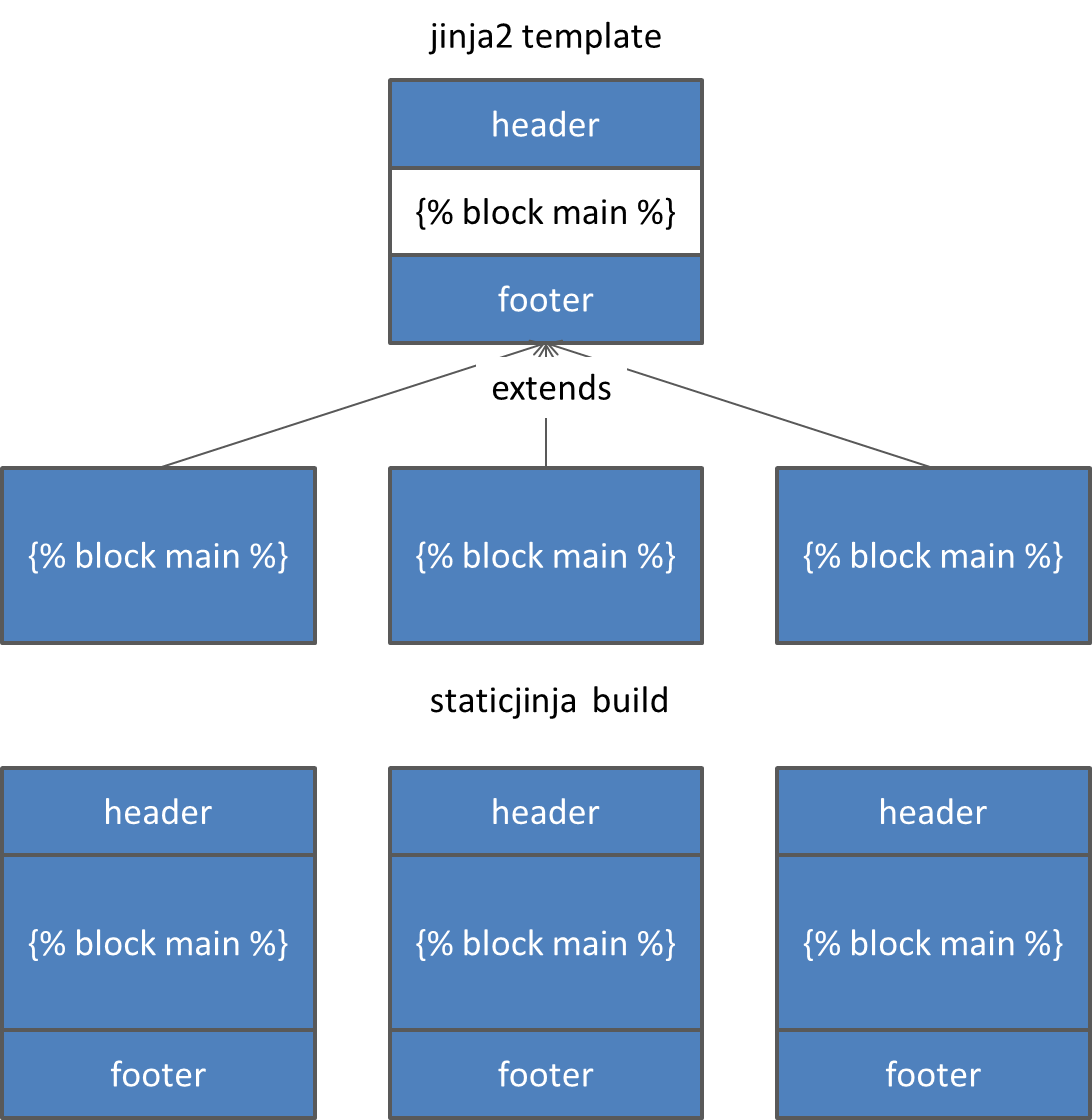
creating HTML files from templates.
We'll investigate this using Jinja2 templates — because they're the same ones we'll use in Flask later.
staticJinja is a program that converts templates into regular HTML web pages.
Repetitive Example
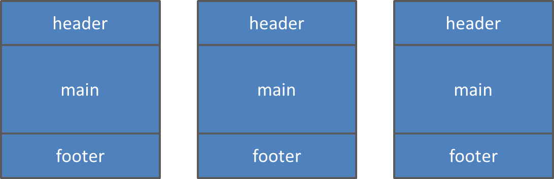
Each page has the same header and footer; only their main differs.
HTML Templates
A Jinja2 Template
Let's say this is stored in base.html:
<!DOCTYPE html>
<html lang="en">
<head>
<meta charset="utf-8" />
<title>{% block title %}{% endblock %}</title>
<link rel="stylesheet" href="styles.css" />
</head>
<body>
<header>
<nav>
<ul>
<li><a href="index.html">Home</a></li>
<li><a href="about.html">About</a></li>
<li><a href="contact.html">Contact</a></li>
</ul>
</nav>
</header>
{% block main %}{% endblock %}
<footer>
<p>
<small>
© Derek Bridge
</small>
</p>
</footer>
</body>
</html>index.html, about.html, contact.html
{% extends 'base.html' %}

{% block title %}
    Home
{% endblock %}

{% block main %}
<main>
    <h1>Welcome!</h1>
    <p>
        This is the home
        page.
    </p>
</main>
{% endblock %}
{% extends 'base.html' %}

{% block title %}
    About
{% endblock %}

{% block main %}
<main>
    <h1>About us!</h1>
    <p>
        This is about who
        we are.
    </p>
</main>
{% endblock %}
{% extends 'base.html' %}

{% block title %}
    Contact
{% endblock %}

{% block main %}
<main>
    <h1>Contact us!</h1>
    <p>
        This is the how
        to contact us.
    </p>
</main>
{% endblock %}
Where Does It Happen?
The browser does not fetch templates and then combine them.
The server does not take templates and combine them.
staticjinja is a quite separate program.
It combines templates.
Then its output (web pages) can be placed on the server.
Browsers and servers work as normal.
They know nothing about templates.
CSS is Hard!
Writing CSS to create a visually appealing web site is difficult.
Writing CSS for a visually appealing, responsive web site is even more difficult.
Making sure that the web site is also accessible is even more difficult.
CSS Frameworks
Prewritten CSS for multi-column sites,
usually liquid, sometimes RWD.
E.g. Bootstrap
Mobile-first and RWD.
Up to 12 equal-sized columns, but you can combine them.
You may need to put some extra divs into your HTML.
You will need to put class attributes onto the elements in your HTML.
You can customize the colours and so on.
Other CSS frameworks: Pico, Tailwind, …
Bootstrap
One way to use Bootstrap:
<!DOCTYPE html>
<html lang="en">
<head>
    <meta charset="utf-8" />
    <meta name="viewport" content="width=device-width, initial-scale=1" />
    <title>Welcome!</title>
    <link href="
</head>
<body>

    <-- Your stuff goes here -->

    <script src="https://cdn.jsdelivr.net/npm/bootstrap@5.3.8/dist/js/bootstrap.bundle.min.js" integrity="sha384-FKyoEForCGlyvwx9Hj09JcYn3nv7wiPVlz7YYwJrWVcXK/BmnVDxM+D2scQbITxI" crossorigin="anonymous" />
</body>
</html>
Example
<!DOCTYPE html>
<html lang="en">
<head>
    <meta charset="utf-8" />
    <meta name="viewport" content="width=device-width, initial-scale=1" />
    <title>Welcome!</title>
    <link href="https://cdn.jsdelivr.net/npm/bootstrap@5.3.8/dist/css/bootstrap.min.css" rel="stylesheet" integrity="sha384-sRIl4kxILFvY47J16cr9ZwB07vP4J8+LH7qKQnuqkuIAvNWLzeN8tE5YBujZqJLB" crossorigin="anonymous" />
</head>
<body>
    <header>
        Header
    </header>
    <div class="row" role="presentation">
        <nav class="col-sm-4">
            Nav
        </nav>
        <main class="col-sm-8">
            Main
        </main>
    </div>
    <footer>
        Footer
    </footer>
</body>
</html>
CSS Frameworks
- Advantages of CSS frameworks:
- they can make you more productive;
- they often follow good practice.
- Disadvantages of CSS frameworks:
- they bloat your HTML with
divs and class attributes (class-itis!) for presentational purposes; - their CSS download is large because it contains much you don't need (unless you custom build it);
- they make strong assumptions (although, if you know CSS well enough, you can customize/override).
- maybe they result in a web that looks very same-y.
- they bloat your HTML with
GenAI
- Many CMS and web site builder tools now have a dialog box for chatting with AI. e.g. squarespace.
- Or you can just prompt GenAI to generate the whole site, either a generic tool such as Gemini or one that is specifically for web site building, e.g. lovable, e.g.:
Conclusion
Our study of Web Development in the case of static web sites ends here.
We have only scratched the surface!
But, we will resume with a study of Web Development in the case of dynamic web sites.