CSS layout II
Derek Bridge
Department of Computer Science,
University College Cork
CSS layout I
Aims:
- to learn how to use CSS to achieve multi-column, liquid layouts
- to learn the usefulness of, but also difficulties with, hybrid layouts
- to learn how to use CSS3 media queries to make responsive designs that adapt to the user's viewport
Liquid layouts
- For liquid layout, replace pixels by percentages
- But be aware of the context: percentages are proportions of the width of this context
- When setting an element's width, the context is the element's container, not the page
- When setting an element's margins, the same again
- When setting an element's padding, the context is the width of the element itself
Three-column layout - centred - liquid
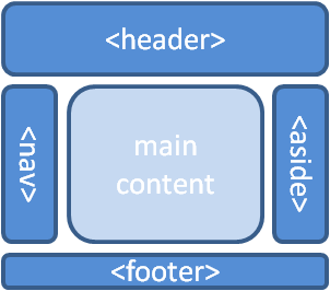
Assume nav, then #main, then aside is the logical order
#wrapper
{
    margin-left: auto;
    margin-right: auto;
    width: 76%;
}

nav
{
    float: left;
    width: 20%;
}

#main
{
    float: left;
    width: 55%;
}

aside
{
    margin-left: 75%;
}

footer
{
    clear: both;
}
Class exercise: Suppose viewport is 1000px wide. How wide will #wrapper, nav, #main and
aside be?
Hybrid layouts
- Hybrid layouts —mixing fixed-width with liquid or elastic elements— are common
- Most common is to have a liquid layout but to impose limits: min and/or max widths in pixels
- Suppose your liquid layout looks wrong when too narrow and/or too wide: put limits on
#wrapper#wrapper { margin-left: auto; margin-right: auto; width: 76%; min-width: 400px; max-width: 1000px; }The content will not exceed 1000px even if the viewport allows it. Equally, if the viewport is too small for 400px of content, a horizontal scrollbar will appear.
Hybrid layouts
- More common is to want minimum widths on individual columns
- Either because a column becomes unreadable when too narrow
- Or because a column contains some fixed width content such as an image
- Or because nasty things happen when the viewport is too narrow, e.g. columns overlap, or one column appears below, instead of alongside, another
- You might think you just put a minimum width on the column(s)
nav { float: left; width: 20%; min-width: 152px; } - But this makes the nasty things more likely! And what do you set the widths/margins of other elements to?
-
Other options:
- Don't use min-widths on columns: so what if the page looks bad when really narrow?
- Read-up on approaches that use negative margins: they can get this right
- Use a responsive design
Responsive web design
- A flexible (liquid) layout, based on a grid
- Flexible image and media
- Media queries
CSS3 Media queries
-
E.g.
@media screen and (max-width: 768px)
{
    h1
    {
        font-size: 1.5em;
    }

    h2
    {
        font-size: 1.2em;
    }
}
The browser uses the enclosed CSS (e.g. scalingh1's to 1.5em instead of the more usual 2em) only if the browser's viewport is no wider than 768px widthrefers to the viewport width (browser window): use it rather thandevice-width(screen)
CSS3 Media queries
- Simple media queries comprise
- the media type:
screen,printand 8 more - an expression: a device feature (e.g.
min-width) and avalue(e.g.768px) in parentheses - the enclosed CSS
- the media type:
- The browser applies the enclosed CSS only if the query is true
CSS3 Media queries
- We could use a media query in our stylesheet to
- correct imperfections, e.g. stop the page from looking 'broken' when the user's window is too narrow
- adapt to a range of devices, e.g. tablets and Internet-enabled phones
Mobile first
- A new idea: don't design your page for the desktop and then use media queries to fix it for narrow windows and for mobile devices
- Instead:
-
Write nice HTML
- no presentational markup
- logical order
- validate it
-
Write some core CSS
- usually a single column layout
- something that looks OK at the narrowest reasonable viewport widths
- Write a media query that applies extra styles for relevant resolution breakpoints
- e.g. multi-column when viewport width allows it
- will tend to use
min-widthrather thanmax-width
-
Write nice HTML
Example of mobile-first responsive web design
/* Styles that always apply, e.g.: */
body
{
    font-family: Verdana, Arial, Helvetica, sans-serif;
}

#wrapper
{
    margin: 0 10px 0 10px;
    background-color: #fff;
}

nav ul
{
    list-style: none;
}

/* Styles that give a two-column layout when there is enough room, e.g.: */
@media screen and (min-width: 768px)
{
    #wrapper
    {
        margin-left: auto;
        margin-right: auto;
        width: 76%;
    }

    nav
    {
        float: left;
        width: 20%;
    }

    #main
    {
        margin-left: 20%;
    }

    aside
    {
        margin-left: 20%;
    }

    footer
    {
        clear: both;
    }
}

/* Styles that give a three-column layout when there is even more room, e.g.: */
@media screen and (min-width: 1024px)
{
    #main
    {
        float: left;
        width: 55%;
        margin-left: 0
    }

    aside
    {
        margin-left: 75%;
    }
}
Resolution breakpoints
| 320px | For small screen devices, like phones, held in portrait mode |
| 480px | For small screen devices, like phones, held in landscape mode |
| 600px | Smaller tables, like the Kindle (660×800) and Nook (600×1024), held in portrait mode |
| 768px | Ten-inch tablets like the iPad (768×1024) held in portrait mode |
| 1024px | Tablets like the iPad held in landscape mode, as well as some laptop, netbook and desktop displays |
| 1200px | For widescreen displays, primarily laptop and desktop browsers |
From Responsive Web Design, Ethan Marcotte
And see resizeMyBrowser
How widely does it work?
- Ethan Marcotte advises you to also add the following inside your
headelement to fix a problem with some mobile phone browsers:<meta name="viewport" content="initial-scale=1.0, width=device-width" />
- CSS3 media queries browser support: Firefox 3.5+, Opera 9.5+, Safari 3+, Chrome, IE9+, and most mobile browsers
- Question: So what will you see if your browser doesn't support media queries?
A few final thoughts
- Responsive Web Design is "a more flexible, device-agnostic approach for designing for the web"
- Some people argue instead (or as well) for developing multiple Web sites (with different URLs) for different contexts: e.g. one for desktop browsers and one mobile-specific site
- Is this a good idea? Discuss!