CSS declarations I
Derek Bridge
Department of Computer Science,
University College Cork
CSS declarations I
Aims:
- to learn CSS declarations for choosing fonts and formatting text
- to learn a little about the CSS box model
- to learn how and why to change element display roles
- to learn how to use CSS to centre elements
CSS Cheat Sheets
Fonts
- Some fonts are proportional, others are monospace
- Some fonts have serifs, others are sans-serif
- Common (but slightly dated) advice is to use serif for print and sans-serif for display
Fonts on the Web
- You do not know what fonts will be available on your user's machine
- different platforms come with different fonts installed
- many software packages install further fonts
- Even the Core Web Fonts were never wholly universal
- But take a look at
- codestyle.org's Web font survey results
- Richard Rutter's font matrix (but it's from 2007)
Font families
- Use the
font-familyproperty but give it multiple values (a font stack) to cover multiple platforms, e.g.:body { font-family: Verdana, Geneva, Tahoma, sans-serif; } - First give the ideal font, then some good but not ideal alternatives, then some common alternatives, then a generic
- A good font for regular text is not necessarily good for headings: see Better CSS Font Stacks
Downloadable fonts
- CSS3 has downloadable fonts using the
@font-facerule@font-face { font-family: MuseoSans; src: url('fonts/museo_sans.otf') format( "opentype" ); } h1 { font-family: MuseoSans, Arial, sans-serif; } - The browser requests the
museo_sans.otffile and then uses it (in this case, forh1s) - Obviously, the file needs to be where you say it is, e.g. on your server
- Problem: copyright! (Even buying a copy may not entitle you to put it on your server — since then you're effectively giving it away)
- Try: Google Web fonts
Absolute font sizes (avoid!)
- The
font-sizeproperty, e.g.:body { font-size: 11px; } - Points (= 1/72th inch), picas (= 1/6th inch), inches, millimetres, centimetres:
- For display, avoid!
- For print, use points
- Pixels:
- Useful for the dimensions of images and fixed-width designs
- But for fonts, it can be more productive to work with relative sizes
Relative font sizes
- E.g.:
body { font-size: 2em; /* or 200% */ } h1 { font-size: 1.5em; /* or 150% */ } - Relative measures (em, percentage, ex)
- These are relative to the inherited font size
- In the example above, suppose the default font size is 16px. How big is the text in the
h1? - If it all looks too big (or small), change the
font-sizeof thebodyand everything else will change in proportion - Good: ems (height of capital M) or percentages
- Avoid: exs (height of x), not widely supported by browsers
Font weight and style
- Font weight can make text bold:
ul { font-weight: bold; } - Font style can italicise:
ul
{
    font-style : italic;
}
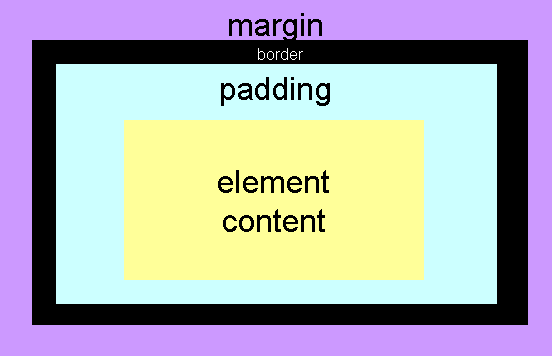
Boxes
- Every HTML element generates one or more boxes
- In the CSS, you can set the
widthandheight- This refers to the width/height of the element content, not the whole box (in most browsers!)
- Note that background colours and images affect the element content and the padding, not the border and margin
Element display roles
- CSS assigns a display role to every element
- The two main display roles:
- Block
- There is a line break before and after the content—hence they stack vertically
- Inline
- There is no line break before and after the content—they flow onto the current line of text within their container
- Initially in CSS all elements are inline
- But your browser's default stylesheet applies defaults that are more sensible:
header, nav, section, aside, figure, figcaption, div, p, h1, h2, h3, h4, h5, h6,…
{
    display: block;
}

em, i, strong, b, a, img, ...
{
    display: inline;
}
Using CSS to change the element display role
- Using the
displayproperty, we can- change block-level elements (and similar elements such as
li) to inline - change inline-level elements (such as
aandimg) to block-level - E.g. this used to be common:
img
{
    display: block;
}
But in this case there's another way to mark this up to achieve the same effect now. What is it?
- change block-level elements (and similar elements such as
Centering I
- Use
text-alignto centre text, images (and other elements that have inline display role) that are within a container element such asp,td, etc. e.g.:p { text-align: center; } - Note that this does not affect the alignment of the container element itself
Centering II
- But set the margins to centre a
container (e.g. a table, a navigation menu, etc.)
within, e.g., the page:
p { margin-right: auto; margin-left: auto; width: 760px; } - Note that nothing will happen unless the width of the element is set to be narrower than the page