Web Development
Dr Derek BridgeSchool of Computer Science & Information Technology
University College Cork
Lecture Objectives
- learn the principles of responsive layout
- learn how to use CSS media queries for responsive layouts
- learn to solve the problems caused by images in responsive layouts
Warning
Fog of details ahead!
Do not 'learn off'.
Look-up when needed.
Responsive Web Design (RWD)
In RWD, we adapt the layout to the characteristics of the window/device.
Responsive Components
Some of the things we have seen so far are already helpful for RWD.
Liquid layouts, using relative units or percentages.
Flexbox, assuming, e.g. we allow items to wrap and to flex.
Grid layout, if we use, e.g., repeat(auto-fill, 20em)
When these do not suffice, then use media queries.
CSS Media Queries
body {
    color: white;
    background-color: black;
}

@media screen and (min-width: 600px) {
    body {
        background-color: red;
    }
}

@media screen and (min-width: 800px) {
    body {
        background-color: blue;
    }
}

@media screen and (min-width: 1000px) {
    body {
        background-color: yellow;
    }
}
- Use a black background.
- But, if the viewport is at least 600px, use a red background.
- But, if the viewport is at least 800px, use a blue background.
- But, if the viewport is at least 1000px, use a yellow background.
Media Queries
@media screen and (min-width: 800px) {
    …
}
Simple media queries comprise:
the media type: e.g. screen
an expression containing a media feature (e.g. min-width) and a value (e.g. 800px) in parentheses; and
some CSS between curly braces.
A list of the media features that you can use.
Container Queries
Media Queries apply styles based on device characteristics,
e.g. viewport width.
CSS now offers Container Queries:
these apply styles based on the size of an element's container.
        @container (width > 800px) {
            …
        }
Sorry! We don't have time to cover these in lectures.
Media Queries for RWD
RWD uses media queries to adapt to a range of devices.
E.g.
a single-column layout for narrower viewports;
but one or more multi-column layouts for wider viewports.
Mobile-first
-
Write your core CSS:
- colours; borders; fonts; margins; padding
- Write CSS for the narrowest reasonable viewport widths:
- e.g. a single-column layout
- (maybe you won't need any CSS!)
- Write successive media queries that apply extra styles for relevant breakpoints:
- e.g. multi-column when viewport
min-widthallows it; - e.g. even ultimately a fixed-width design for very wide viewports.
- e.g. multi-column when viewport
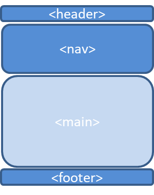
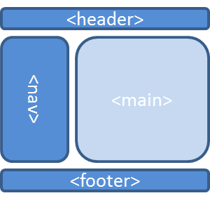
Simple RWD Example
- In narrow-screen devices, we will use a one-column layout.
- In wider devices, we will use a two-column layout.
Simple RWD Example: CSS
/* Core CSS */

/* Put your core CSS here
   (colours; borders; fonts; margins; padding)
*/

/* Single-column layout for narrow devices */

body {
    margin: 0;
}

/* Two-column layout for wider devices */

@media screen and (min-width: 600px) {

    body {
        width: 80%;
        margin: 0 auto;
        display: grid;
        grid-template-columns: 1fr 3fr;
        grid-template-areas: "top top"
                             "middle-left middle-right"
                             "bottom bottom"
    }

    header {
        grid-area: top;
    }

    nav {
        grid-area: middle-left;
    }

    main {
        grid-area: middle-right;
    }

    footer {
        grid-area: bottom;
    }
}
Common Breakpoints
| 320px | For small screen devices, like phones, held in portrait mode |
| 480px | For small screen devices, like phones, held in landscape mode |
| 600px | Smaller tablets held in portrait mode |
| 768px | Ten-inch tablets held in portrait mode |
| 1024px | Ten-inch tablets held in landscape mode, as well as some laptop, netbook and desktop displays |
| 1200px | For widescreen displays, primarily laptop and desktop browsers |
Problem!
there is a much wider range of devices and viewports than this table assumes;
the table is not future-proof.
A Problem
Many small-screen devices draw a distinction between the layout viewport and the visual viewport.
Media queries use the layout viewport and so might not work as expected.
A Fix
To make RWD work on these devices, we need to make the two viewports of equal size.
Add the following inside the head element of each page of HTML:
<meta name="viewport"
      content="initial-scale=1.0, width=device-width" />
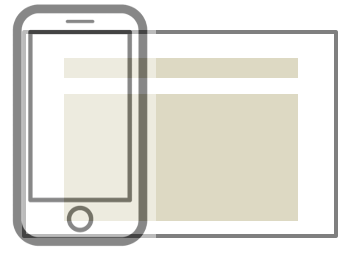
Another Problem: Images
In liquid layouts, you don't know how much space is available for your images.
If the image is wider than the available space, it will overflow its container.
In liquid layouts, we will have to allow the browser to scale the image.
Images for Liquid Layouts
Responsive Web Design recommends we set the max-width to 100% in the CSS:
img {
    max-width: 100%;
}
If the image is narrower than its container, it will display at its normal size.
If it is wider than its container, it will be scaled down to match the width of the container.
Or you could set the width to 100%:
img {
    width: 100%;
}
Then the image scales up or down to match the container.
But There Are Still Problems
- resolution switching problem
- you want to serve smaller image files to narrow screen devices, and also optionally you want to serve different resolution images to high density/low density screens
- art direction problem
- you want to serve different images for different layouts — for example a wide image showing a full scene for a desktop layout, and a narrower, cropped image showing a close-up for a mobile layout
Resolution Switching
HTML solves this using the srcset and sizes attributes, e.g.:
<img
     srcset="wombat-small.jpg 480w,
             wombat-large.jpg 800w"
     sizes="(max-width: 600px) 480px,
            800px"
     src="wombat-large.jpg"
     alt="..." />
<img
     srcset="wombat.jpg,
             wombat-hi-res.jpg 1.5x"
     src="wombat-hi-res.jpg"
     alt="..." />
The Art Direction Problem
HTML solves this using the picture and source elements, e.g.
<picture>
    <source media="(max-width: 799px)" srcset="wombat-cropped.jpg" />
    <source media="(min-width: 800px)" srcset="wombat.jpg" />
    <img src="wombat.jpg" alt="..." />
</picture>