Web Development
Dr Derek BridgeSchool of Computer Science & Information Technology
University College Cork
Lecture Objectives
- learn about page layout and component layout
- learn a little about flexbox
- learn a little about grid layout
Warning
Fog of details ahead!

Do not 'learn off'.
Look-up when needed.
Page Layout
- Recall: fixed-width and liquid layouts
- Multicolumn page layout, with two or three columns, is very common!
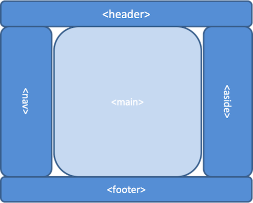
Layout
- We can distinguish:
- Macro layout = page layout
- Micro layout = component layout
- There may be a layout for the page and separate layouts for the components on the page.
- E.g. this is still just a page that has a three-column layout:
CSS Layouts
- Flow layout:
- Based on the outer display type of each element.
- Flexbox:
- One-dimensional layout based on rows or columns but elements can 'flex' to fill additional space or shrink to fit smaller spaces.
- Grid layout:
- Two-dimensional layout.
Other: floating, positioning, multicolumn text.
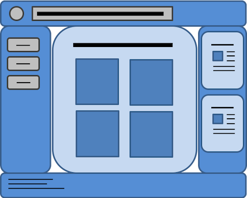
Example
- Grid layout for the page as a whole;
- Flexbox for the header;
- Flow layout or flexbox for the nav and aside;
- The articles in the aside use floating;
- Flexbox or another grid for the gallery of images in the main;
- Flow layout for the footer.
Responsive Web Design (RWD)
In RWD, we adapt the layout to the characteristics of the device/window.
E.g. page layout
one-column layout for narrow devices/windows;
two-column layout when there is more room;
three-column layout when there is even more room.
E.g. component layout
elements are stacked on narrow devices/windows;
they are side-by-side when there is more room.
CSS Flexbox
A flexbox contains items, which are laid out in a one-dimensional way,
either in rows or in columns.
The items in the flexbox can 'flex',
grow or shrink.
Don't use flexbox when flow layout is sufficient!
Flexbox Properties
On the container:
display: flex;
| Parent properties (the flexbox itself) (the container) |
Child properties (the flex items) (the contents) |
|---|---|
flex-direction |
order |
flex-wrap |
flex-grow |
justify-content |
flex-shrink |
align-items |
flex-basis |
align-content |
align-self |
Example
<section class="parent">
    <article class="child">
        <p>
            Short text.
        </p>
    </article>
    <article class="child">
        <p>
            This is a much longer text. The reason it is
            longer is because it has a lot more words in
            it. Words like these. And these. Also these.
        </p>
    </article>
    <article class="child">
        <p>
            This is a medium-length text.
        </p>
    </article>
</section>
.parent {
    width: 80vw;
    height: 80vh;
    margin: 0 auto;
    background-color: lightblue;
}

.child {
    padding: 1em;
    border: 1px solid black;
    background-color: yellow;
}
We see a big blue area with three yellow boxes, layed out using flow layout.
Example, cont'd
- Now introduce the flexbox
flex: initial
items have the default size and do not growflex: auto
items can grow but larger items get more of the spaceflex: 1
items can grow but they share all the space equally- With
flex: initial, see howjustify-contentdistributes spare space in the flex direction, andalign-itemsdistributes spare space in the other direction
.parent {
    display: flex;
    flex-direction: row;
    flex-wrap: nowrap;
    justify-content: flex-start;
    align-items: flex-start;
}

.child {
    flex: initial;
}
Example, cont'd
- Now include lots more
articles in the HTML - Change
flex-wrap: nowraptoflex-wrap: wrap - Do not expect items to line-up in columns with items in previous rows (unless you fix their sizes)
- If you were hoping they'd easily line-up, use grid layout
.parent {
    display: flex;
    flex-direction: row;
    flex-wrap: wrap;
    justify-content: flex-start;
    align-items: flex-start;
}

.child {
    flex: initial;
}
CSS Grid Layout
Grid Layout makes two-dimensional layouts easy (easier).
A grid contains items arranged in columns and rows
CSS Grid Layout
A grid contains items arranged in columns and rows
Example, cont'd
- Still with lots of
articles, replace the flexbox by grid - Change
grid-template-columnsto, e.g.1fr 2fr 1frrepeat(4, 1fr)3fr repeat(2, 1fr)repeat(auto-fill, 20em)
- Introduce
gap: 1em;
.parent {
    display: grid;
    grid-template-columns: 1fr 1fr 1fr;
}