Web Development
Dr Derek BridgeSchool of Computer Science & Information Technology
University College Cork
Lecture Objectives
- learn how to center things
- learn how to layout a
navand aheader - learn how to layout a multi-column page
Warning
Fog of details ahead!

Do not 'learn off'.
Look-up when needed.
Centering Text
To center text or an image horizontally within a parent element, use
text-align: center;
p {
    text-align: center;
}
Centering a Block
To center a single element whose display is block horizontally within a parent element, set its left and right margin to auto.
(Note that nothing will happen unless the element is narrower than the parent.)
p {
    margin-left: auto;
    margin-right: auto;
}
Common shorthand:
p {
    margin: 0 auto;
}
Centering the Page
The same technique is often used to center the whole web page, e.g.:
html {
    background-color: white;
}

body {
    width: 80%;
    margin: 0 auto;
    background-color: green;
}
Centering Several Elements
To center several elements elements horizontally within a parent element, use a flexbox and set justify-content.
.parent {
    display: flex;
    flex-direction:row;
    flex-wrap: nowrap;
    justify-content: center;
    align-items: center;
    gap: 1em;
}

.child {
    flex: 1;
}
Styling a nav
<nav>
    <a href="">Wombats</a>
    <a href="badgers.html">Badgers</a>
    <a href="squirrels.html">Squirrels</a>
</nav>
nav {
    background-color: gray;
    padding: 1em;
}

nav a {
    color: black;
    background-color: white;
    border: 1px solid black;
    padding: 1em;
    text-align: center;
    text-decoration: none;
}
We see a horizontal menu. Why?
What is a one-line way to make it a stacked menu?
Styling a nav
- We can get fine-control over widths, spacing and direction using a flex box.
- Change from
flex-direction: rowtocolumnto get a stacked menu. But swap the values ofjustify-content/align-items. Why?
nav {
    background-color: gray;
    padding: 1em;
    display: flex;
    flex-direction: row;
    flex-wrap: wrap;
    justify-content: space-between;
    align-items: center;
    gap: 1em;
}

nav a {
    color: black;
    background-color: white;
    border: 1px solid black;
    padding: 1em;
    text-align: center;
    text-decoration: none;
    flex: 1;
}
Styling a nav
- We can highlight the menu item that corresponds to the page we are on (there is no point clicking this item)
- We can highlight the menu item that the user is about to click
nav a[href=""]
{
    color: rgb(200 200 200);
}

nav a:hover
{
    background-color: rgb(200 200 200);
}
Styling a header 1
<header>
    <img src="web.png" alt="Web Dev logo"
            width="128" height="128" />
    <h1>Web Development
</header>
header {
    border: 1px solid black;
    display: flex;
    flex-direction: row;
    flex-wrap: wrap;
    justify-content: flex-start;
    align-items: center;
    gap: 2em;
}

header h1 {
    font-size: 2em;
}
Styling a header 2
<header>
    <h1>Web Development
    <nav>
        <a href="">Wombats</a>
        <a href="badgers.html">Badgers</a>
        <a href="squirrels.html">Squirrels</a>
    </nav>
</header>
header {
    border: 1px solid black;
    display: flex;
    flex-direction: row;
    flex-wrap: wrap;
    justify-content: space-between;
    align-items: center;
    gap: 2em;
}

header h1 {
    font-size: 2em;
}

nav {
    padding: 1em;
    display: flex;
    flex-direction: row;
    flex-wrap: wrap;
    justify-content: space-between;
    align-items: center;
    gap: 1em;
}

nav a {
    color: black;
    background-color: white;
    border: 1px solid black;
    padding: 1em;
    text-align: center;
    text-decoration: none;
    flex: 1;
}

nav a[href=""]
{
    color: rgb(200 200 200);
}

nav a:hover
{
    background-color: rgb(200 200 200);
}
Styling a header 3
<header>
    <img src="web.png" alt="Web Dev logo"
            width="128 height=128" />
    <h1>Web Development
    <nav>
        <a href="">Wombats</a>
        <a href="badgers.html">Badgers</a>
        <a href="squirrels.html">Squirrels</a>
    </nav>
</header>
header {
    border: 1px solid black;
    display: flex;
    flex-direction: row;
    flex-wrap: wrap;
    justify-content: flex-start;
    align-items: center;
    gap: 2em;
}

header h1 {
    font-size: 2em;
}

nav {
    margin-left: auto;
    padding: 1em;
    display: flex;
    flex-direction: row;
    flex-wrap: wrap;
    justify-content: space-between;
    align-items: center;
    gap: 1em;
}

nav a {
    color: black;
    background-color: white;
    border: 1px solid black;
    padding: 1em;
    text-align: center;
    text-decoration: none;
    flex: 1;
}

nav a[href=""]
{
    color: rgb(200 200 200);
}

nav a:hover
{
    background-color: rgb(200 200 200);
}
Stacked Page Layout
<body>
    <header>
        …
    </header>
    <nav>
        …
    </nav>
    <main>
        …
    </main>
    <footer>
        …
    </footer>
<body>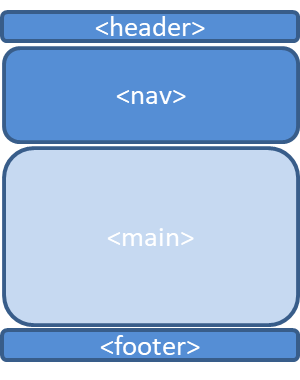
CSS flow layout takes care of this!
Two-column Page Layout
<body>
    <header>
        …
    </header>
    <nav>
        …
    </nav>
    <main>
        …
    </main>
    <footer>
        …
    </footer>
<body>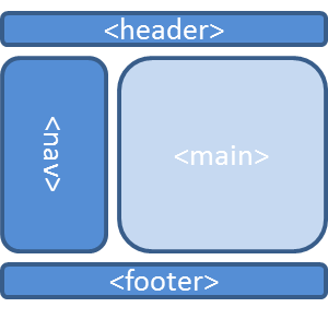
This can be done using either flexbox or grid
Two-column using Flexbox
<body>
    <header>
        …
    </header>
    <nav>
        …
    </nav>
    <main>
        …
    </main>
    <footer>
        …
    </footer>
<body>
body {
    display: flex;
    flex-direction: row;
    flex-wrap: wrap;
    justify-content: flex-start;
    align-items: center;
}

header {
    width: 100%;
}

nav {
    width: 25%;
}

main {
    width: 75%;
}

footer {
    width: 100%;
}
Two-column using Grid
<body>
    <header>
        …
    </header>
    <nav>
        …
    </nav>
    <main>
        …
    </main>
    <footer>
        …
    </footer>
</body>
Two-column using Grid
<body>
    <header>
        …
    </header>
    <nav>
        …
    </nav>
    <main>
        …
    </main>
    <footer>
        …
    </footer>
<body>
body {
    display: grid;
    grid-template-columns: 1fr 3fr;
    grid-template-areas: "top top"
                         "middle-left middle-right"
                         "bottom bottom"
}

header {
    grid-area: top;
}

nav {
    grid-area: middle-left;
}

main {
    grid-area: middle-right;
}

footer {
    grid-area: bottom;
}